Redesigning the Cupcake E-Commerce Experience
Website
Overview
Toronto Cupcake is a famous cupcakery based in Canada, well-known for its custom cupcakes. It is a local business founded in 2010. Their sales cover three different categories: daily fresh cupcakes, baking for events, and corporate orders. Their main customers are from Toronto, though they occasionally have overseas customers as well. Most of their sales are conducted in person rather than online.
As part of my studies, I participated in this project as a member of a team of three. Our task was to identify and analyze issues on a website, and develop the best research strategy to address them, taking into account our limitations.
Role
Platform
Process
Duration
Tools
Team Size
UX/UI Designer
Desktop
5 months
Figma, FigJam, Photoshop
3 Members
Discover, Define, Ideate,Implement

We followed the Double Diamond approach, aiming to incorporate the key phases of Discovery, Definition, Ideation, and Implementation into our work.
#Steps
Design Process
#brainstorming
project kickoff
Our initial project meeting established a clear direction. We recognized the importance of direct communication with the client and initiated contact with the Toronto Cupcake founder to gain a comprehensive understanding of business objectives and user pain points. While we encountered challenges in accessing real users, we proactively adapted by conducting thorough Google reviews analysis to gather valuable insights. To compensate for the lack of direct user interviews, we employed a robust research methodology, combining heuristic evaluation, competitive analysis, and SWOT analysis. This strategic approach laid a strong foundation for the project moving forward.
#brainstorming
STUDY USERS
Reading reviews gave us a comprehensive view of our business's strengths, customer needs, satisfaction levels, and pain points. This information guided us through each step of our design process.

#brainstorming
Heuristic Evaluation
In our team, we evaluated the website from both a user's and a UX designer's perspective. This approach helped us identify key issues:
A cluttered homepage that impeded intuitive navigation
Confusing titles lead to frustration in locating desired products
Failure to highlight the best-selling item
Difficulty determining the price of certain items
Absence of search functionality
Lack of a distinctive character to connect with the brand
A deficiency in attention to user interface design


#competitors
competitive analysis
Conducting this analysis effectively was challenging due to the difficulty in identifying key competitors. To overcome this, we searched for similar businesses in nearby neighborhoods using Google Maps and reviewed their websites to identify potential competitors. By examining their structure and functionality, we gained valuable insights into how others address similar issues, which shaped the foundation of our information architecture and user flow. Additionally, we analyzed global platforms like Starbucks and Dunkin' Donuts, using their design approaches to inform the development of our website.
Our analysis identified three key areas where our website can excel. Firstly, offering customizable cupcakes sets us apart from competitors and should be highlighted to showcase its appeal. Secondly, Clearly showcasing our daily cupcake offerings can boost customer confidence and increase order frequency. Our event planning and baking partnerships offer a unique advantage that attracts business clients and event organizers.
Additionally, our analysis highlights two key areas for improvement: enhancing the website's visual appeal and making the user journey more intuitive and enjoyable.

#business
SWOT
Drawing from our research, including the current website, reviewing all social media comments, and performing a competitive analysis, we gained a thorough understanding of our business, which informed the creation of the following chart.
Our business focuses solely on selling cupcakes
Prompt and Friendly Customer Service
Capability to personalize an order
widely recognized in the neighbourhood
Providing an extensive selection of products
utilizing high-quality ingredients
Our business opening new shop
Our competitors do not offer personalized products, which could become our distinctive feature
Our collaboration with other businesses helps to make our business known and attract more customers
Our competitors offer superior online services.
We are losing customers because of our ineffective website
products, which could become our distinctive feature
Poor website, both visually and functionally
Minimal engagement on social media to promote their product
Weak branding
Absence of online costumer service
No Updates
Strengths
Opportunities
Threats
Weaknesses
#Learning
Takeaways
We were surprised to discover that a lot of the reviews were positive, which got us thinking about why that might be. It turns out our business thrives because we offer unique, high-quality products and have built a loyal customer base. Trust has been earned through good customer service, which is a big part of our success.
In our research, we found that many people in Canada still prefer traditional ways of buying—like calling or shopping in person—over using a website. This shows how much culture and location matter. It also explains why the founder of Toronto Cupcake hasn’t put a lot of focus on the website, even though there’s been some negative feedback about it.
As UX designers, we realized that our job isn’t just about improving the user experience. We also need to show the founder, with clear examples, how these changes can help the business grow and attract new customers.
#Pain Points
Fun fact
Even UX designers can fall into traps, and we were no exception. During the heuristic evaluation process, we inadvertently ordered a box of cupcakes, leaving us shocked, confused, and astonished.
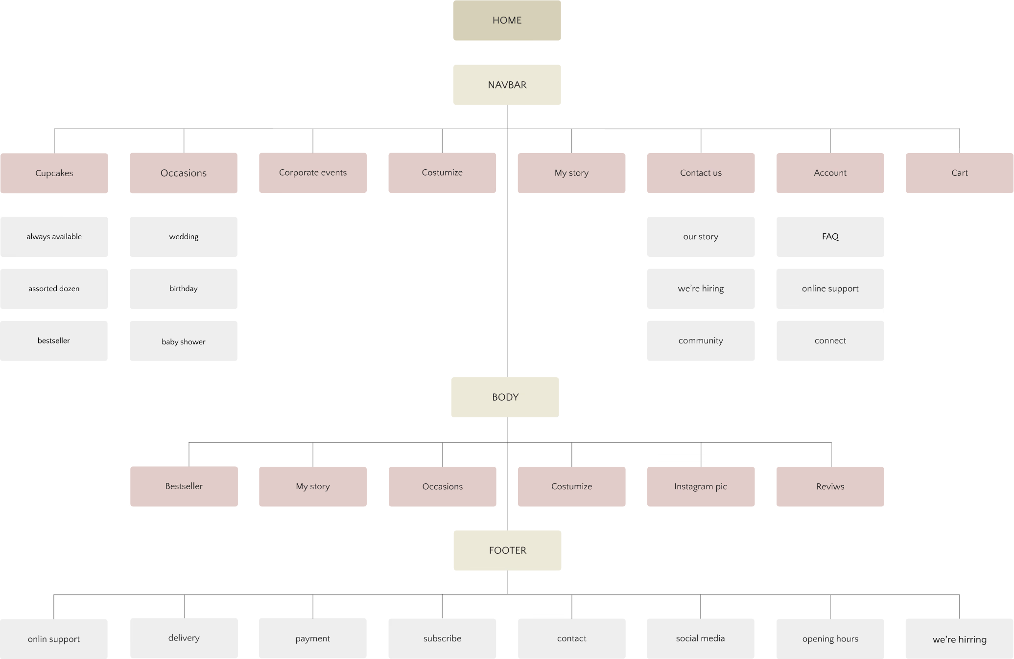
#IA
CArd sorting
To redefine the core structure of our website, we created 42 cards based on our research and asked potential users to categorize them in a way that made sense to them. This helped us uncover their mental models. The picture below represent one of them.

#IA
SITEmap
We carried out a combination of open and closed card sorting with 15 users, which led to the development of the final sitemap shown below.
#users
Persona
At this point, we had a clear picture of our users and had defined our persona. Sandra Williams is a designer living in Toronto who always finds it difficult to find a unique gift that meets all her needs.

#journey
User story
Sandra was chosen to prepare the Christmas gifts this year, following the office tradition where each person takes a turn annually. As usual, she spent a few days searching for ideas until she visited her best friend. While explaining her dilemma and seeking help, Johanna suddenly exclaimed, "I've got it!" and began describing her fabulous experience ordering customized cupcakes from a Toronto cupcake website. They then opened the website and followed the user flow outlined below.

#journey
UserFlow

#HWM
Design Goal
How can we simplify the ordering process and better communicate our products and services to customers?
Our research revealed a notable disconnect between customer expectations and the existing website design. The homepage should quickly inform visitors about products and services, ensure a smooth purchasing process, and build trust by highlighting product quality.
#Discovery
Design Decisions
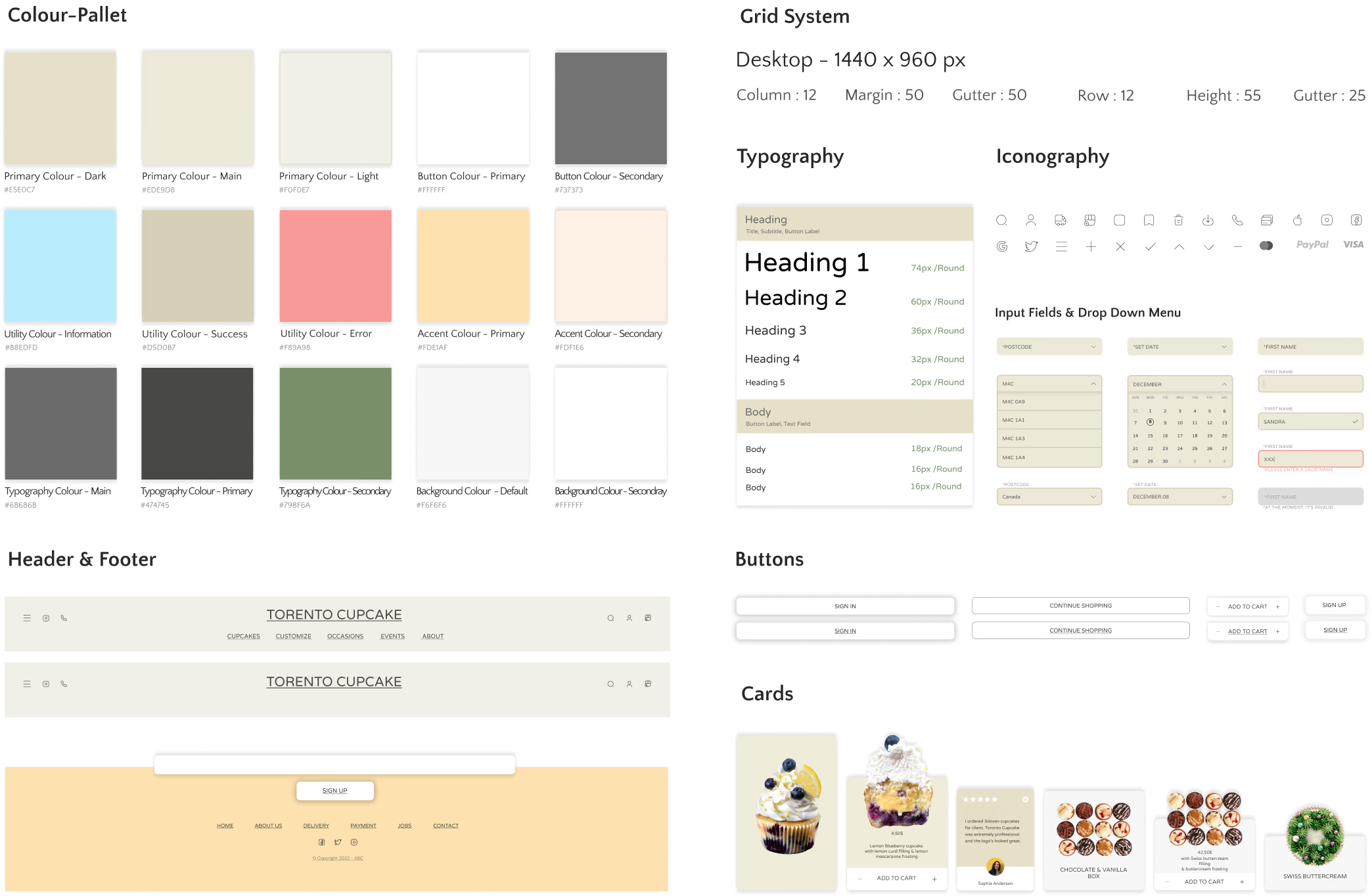
Define a new Design System
Since the website had inconsistent designs across pages and unclear sections, we established a new system to create a cohesive look and improve visitor conversion into customers. Our first step was publishing a UI Kit.
#assets
UI-Kit
#Design
Wire framing
Design Approach
The following outlines the design evolution from the initial wireframe to the final product, based on user testing.
Initial
Existing
Final


Development of the navbar resulted in easier navigation for users.
By developing a custom typeface, we improved text legibility, minimized eye fatigue, and established a unified visual language throughout the design.
By revising page layouts, including margins and spacing, we achieved a clearer visual hierarchy, enhancing the overall design.
To create a lively and engaging aesthetic that reflects our brand, we incorporated a new color.
To enhance user experience, we used high-quality images to clarify content and aid quick information discovery.
Placing CTAs effectively helped users find and engage with the services and products they wanted.
By incorporating a short video showcasing backing process, we not only gained user trust but also created a more dynamic and enjoyable user experience.
Short descriptions were added to each section to offer a quick overview of our services and products.


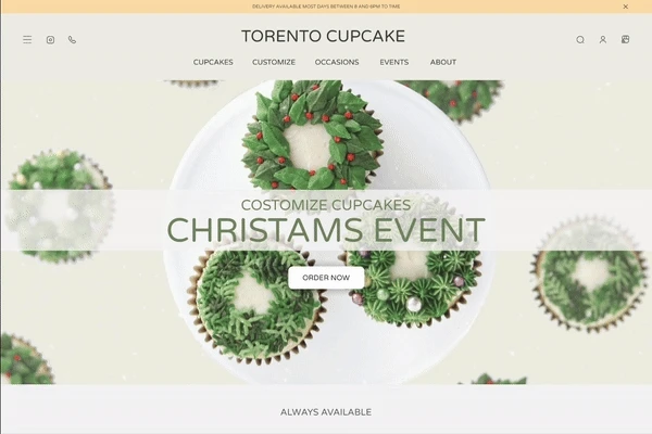
CHOCOLATE OREO
COSTOMIZE CUPCAKES
CHRISTAMS EVENT
ALWAYS AVAILABLE
WE ARE ALWAYS LOOKING FOR FINEST INGREDIENTS
Toronto cupcake is Canada’s favourite haven for gourmet
cupcakes.We pride ourselves on great tasting treats
made from only the finest of ingredients.

BANANA PUDDING

DOUBLE STRAWBERRY

LINDT TRUFFLE

LEMON BLUEBERRY
ORDER NOW
READY TO GO

CHOCOLATE & VANILLA
BOX

CHOCOLATE & RED VELVET
BOX
CHOCOLATE & LEMON
BOX


DOUBLE CHOCOLATE
BOX
A CELEBRATION OF LIFE, LOVE AND MEMORABLE EVENTS
Toronto Cupcake would love to help make your special
occasion one to remember.
COLORFUL CUPCAKES
SPECIAL OCCASIONS
ORDER NOW
SPECIAL CUPCAKES
CORPRATE EVENTS
ORDER NOW


OUR TEAM
FROM PRODUCT/BRAND LUNCH TO CUSTOMER APPRECIATION
Toronto Cupcake IS ABLE TO PROVIDE YOU COSTUM DECORATING TO
MATCH THAT WINING CAMPAIGN
tO GET EARLY ACCESS TO OUR SEASONAL AND EVENTS OFFERS;
KINDLY SUBSCRIBE WITH YOUR E-MAIL IN THE BOX BELOW
TESTIMONIAL
SIGN UP
HOME
ABOUT US
DELIVERY
PAYMENT
JOBS
CONTACT
© Copyright 2022 - ABC
YOUR E-MAIL HERE

Kristin Watson
Got em as Christmas gift from work. Delivered in cute pink box, nicely decorated, festive and tasted delicious.

Jerome Bell
Toronto Cupcake never stops impressing me! I have had over 5 orders and each one of them has been 100% perfect.

Jane Koper
So much attention to detail, great cake flavour and icing! These are not just cupcakes you would find at any shop. They are …

Stephen Brekke
I ordered 3dozen cupcakes for client. Toronto Cupcake was extremely professional and the logo’s looked great.

Sophia Anderson
I ordered 3dozen cupcakes for client. Toronto Cupcake was extremely professional and the logo’s looked great.
Delivery available most days between 8 and 6pm TO time
TORENTO CUPCAKE
CUPCAKES
CUSTOMIZE
OCCASIONS
EVENTS
ABOUT

“In the following section, the design decision focuses specifically on the customized cupcakes feature and the task flow we developed for it. I will then present each page step-by-step, detailing the initial design, the changes made, and how these improvements enhanced the user experience and interface.”
Assigning the hero image to the best-selling product
We asked potential users during the user journey test and card sorting where they thought the best placement for this feature would be. The results indicated that almost all preferred it to be at the top of the homepage.

In our initial design, a delayed slide in the hero image showcased customized cupcakes and key features. However, user testing showed this distracted users, making it harder to focus on the product or take action.
In the final design, we focused solely on customized cupcakes in the hero image.
The high-quality visual instantly conveyed our message, while the well-placed call-to-action button encouraged user engagement.


Exciting Design
Initial
Our research revealed that customized cupcakes are highly popular and should be easily accessible. However, they are currently difficult to find on the website, and the customization process is unclear.
Final
Clearly Communicating Limited Box Size Choices
As a first step it was essential to clearly communicate our service offerings to customers, including the two available box sizes. This upfront transparency helped customers understand their options, streamlining the customization process.

Initial
In first design, we failed to effectively communicate box size limitations, as this information was only revealed at the end of the ordering process. Consequently, user testing revealed significant dissatisfaction, as customers felt misled and were unable to plan their orders accordingly.

Final
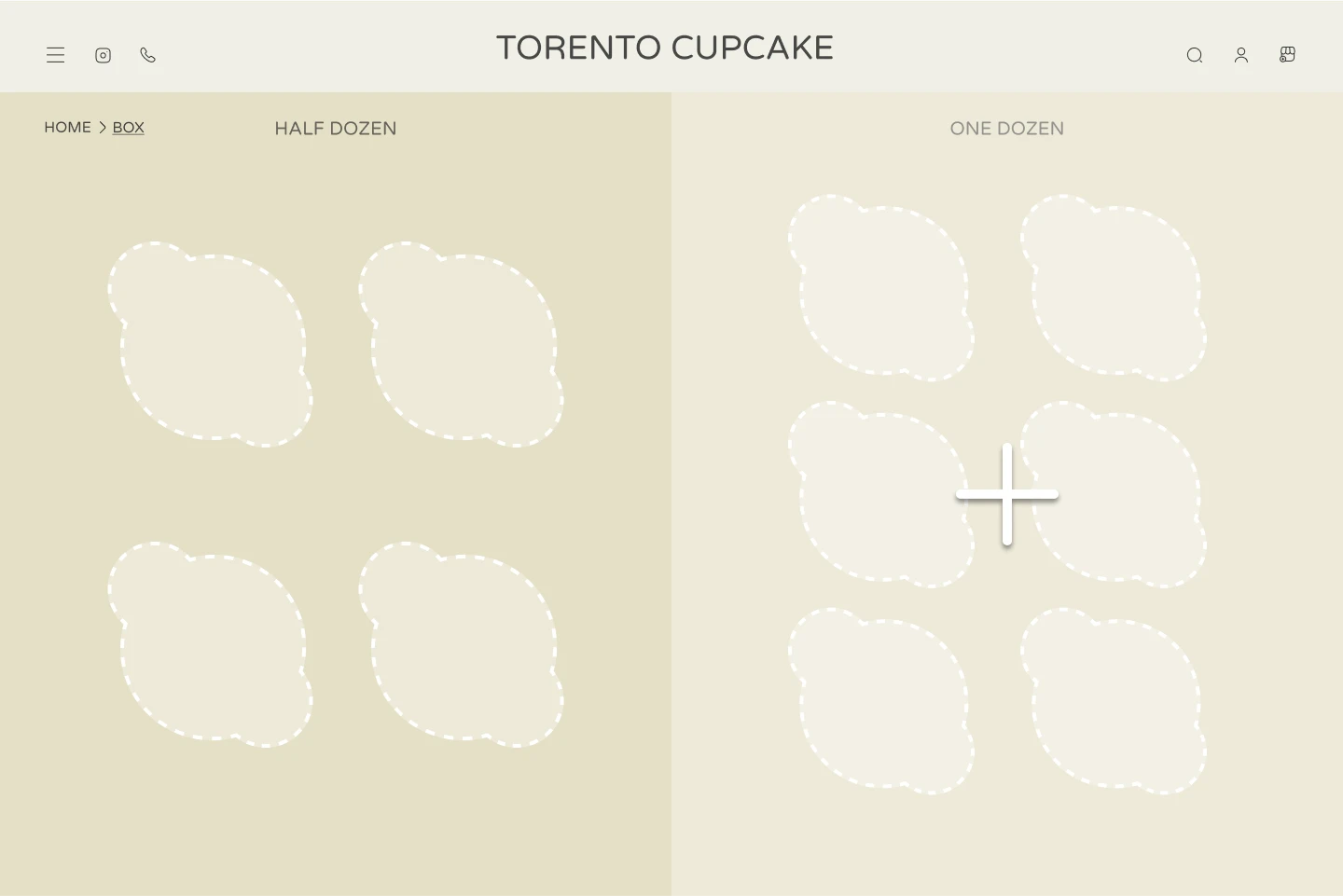
To implement this, we directed customers to a box selection page after clicking "Order Now," offering half a dozen and a dozen options with cupcake capacities. Customers can only customize after choosing a box size.
Exciting Design
The current design presents a significant usability issue by omitting a clear mechanism for customers to specify desired cupcake quantities. This omission hinders the purchasing process and negatively impacts the overall user experience.
Crafting a Real-Shop Experience
Our aim was to provide customers with a fully immersive customization experience, granting them complete control over the process while infusing it with fun. We sought to replicate the in-person shopping experience in the online environment.

The website currently lacks detailed cupcake descriptions and unappetizing product images. This makes it difficult for customers to understand the cupcake flavors and choose their desired treats.
Exciting Design
User testing highlighted that our initial design offered too many choices at once, causing confusion and a stressful user experience. This approach detracted from the enjoyable aspect of cupcake customization.

Initial
To enhance the cupcake selection process, we introduced a drag-and-drop interface, mimicking the in-store experience. Customers can now effortlessly customize their orders step-by-step.
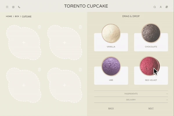
Final
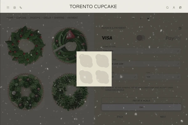
Building a Secure and Intuitive Checkout Flow
We opted for a clean, step-by-step checkout process to boost customer confidence. To achieve this, we created four distinct pages for summary, account, delivery, and payment.
Summary Page
Here, conversion rates and user experience are hindered by confusing information hierarchy, inconsistent design elements, unclear information, and an ambiguous call to action.
Exciting Design

We combined order summary and delivery details on one page. Subsequent user testing revealed several issues, including unclear product details and pricing, missing payment options, and limited order customization.

Initial
We streamlined the design into two sections. Product details and customization options are on the left, while the order summary is on the right. Breadcrumbs and progress indicators guide users through the process.

Final
Delivery
The final design features clear, spacious input fields for personal and address details. We've included the option for separate billing addresses and maintained a logical flow to guide users effortlessly.


Initial
Testing revealed several usability issues. Users often paused, struggling to find information. Unclear titles, especially for billing addresses, caused confusion. Additionally, a single address field didn't meet user expectations for separate billing and shipping inputs.

Exciting Design
Overwhelming text, inconsistent formatting, and a lack of clear headings hinder readability. Unclear delivery options, missing required
fields, and absent error handling further complicate the user experience. Additionally, the page lacks a clear structure and progress indicators, potentially overwhelming users.
Final
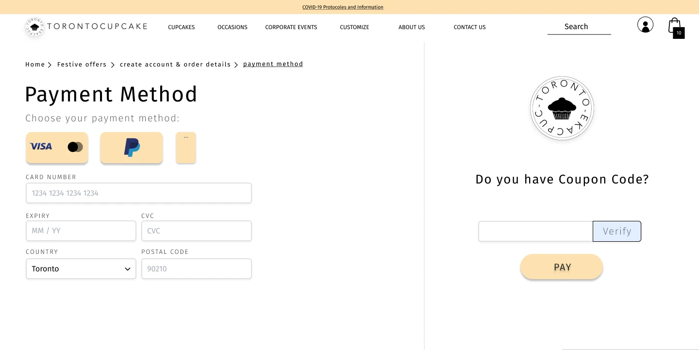
Payment
The current website lacks a dedicated payment page. Instead, payment information is sent to customers via email post-submission, causing significant inconvenience. This multi-step process is time-consuming, disrupts user flow, and increases the risk of user drop-off

Exciting Design
The final design incorporated clearer titles, well-structured layouts, and detailed input fields. By prioritizing essential information and enhancing visual contrast, we improved user flow and instilled confidence in secure shopping.

Final
Initial
Our initial design had several issues. Excessive white space created a overcrowded look, while poor information hierarchy and inconsistent layout hindered usability. We overlooked essential elements like input validation and a clear display of terms and conditions.
#Overview
prototype


Landing Page
Costume page
Payment page
Box page
Summary page
Transfer page
Demo Costume
Delivery page
Confirm page
Prototype
#Steps
Next
Thoroughly test the current design to identify improvement areas.
Design additional pages considering potential user journeys.
Reach out to the business owner to present our design and its potential benefits.
#Learning
Takeaways
Good teamwork and clear communication are key to pulling off tough projects.
Balancing what people want and what looks good is always a challenge.
You have to be ready to change your mind and try new things.
Learning from mistakes is how we get better.
Understanding what people need is the starting point for great designs.
Making things look good and work well is the goal.
Testing your ideas on real people is super important.
